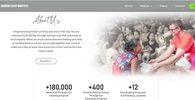
In the digital age, the online presence of a nonprofit organization plays a pivotal role in conveying its mission, connecting with supporters, and driving impact. One compelling example of this mission-driven approach to web design is the Kingdom Legacy Ministries (KLM) website. Let's delve into the key elements that make it an exemplary model for revamping non-profit websites.
1. Purposeful Storytelling
KLM's website doesn't just present information; it tells a compelling story. Through vivid narratives, personal anecdotes, and impactful visuals, visitors gain insight into the lives touched by KLM's mission. The power of storytelling is harnessed to create an emotional connection, driving engagement and support.
2. User-Centric Navigation
Navigation on the KLM website is intuitive and user-centric. A clean layout ensures that visitors can easily find essential information about the organization's initiatives, impact, and ways to get involved. User-friendly navigation is crucial for retaining attention and encouraging exploration.
3. Visual Appeal with Impact
The design elements on KLM's website are not just aesthetically pleasing; they serve a purpose. High-quality images, vibrant colors, and thoughtfully chosen fonts contribute to a visually appealing interface. This visual appeal helps convey the positivity and hope inherent in KLM's mission.
4. Call-to-Action Empowerment
Strategically placed call-to-action buttons empower visitors to take immediate steps, whether it's making a donation, signing up for newsletters, or exploring volunteer opportunities. The website serves as a platform for turning inspiration into action, aligning with KLM's mission to make a tangible difference.
5. Transparency and Impact Measurement
Transparency is a cornerstone of KLM's web design. The website provides clear insights into how donations are utilized, showcasing the impact on the lives of those served. Incorporating real-time metrics and success stories builds trust and reinforces the effectiveness of KLM's mission.
6. Mobile Responsiveness
Recognizing the prevalence of mobile users, KLM's website is fully responsive. Whether accessed from a desktop or a smartphone, the content adapts seamlessly, ensuring that the mission and stories are accessible to a diverse audience.
7. Engaging Multimedia Content
Beyond text, multimedia elements such as videos and photo galleries are strategically embedded throughout the website. These elements bring KLM's work to life, offering a dynamic and immersive experience for visitors.
In conclusion, Kingdom Legacy Ministries‘ website exemplifies the power of mission-driven design for non-profits. By incorporating purposeful storytelling, user-centric features, visual appeal, and transparent communication, KLM effectively engages its audience and catalyzes support. As non-profit organizations embark on revamping their websites, drawing inspiration from KLM's approach can pave the way for greater impact and connection. Subscribe to dennis.tips for more insights on impactful web design.


